The Command Surface, Re-Cut
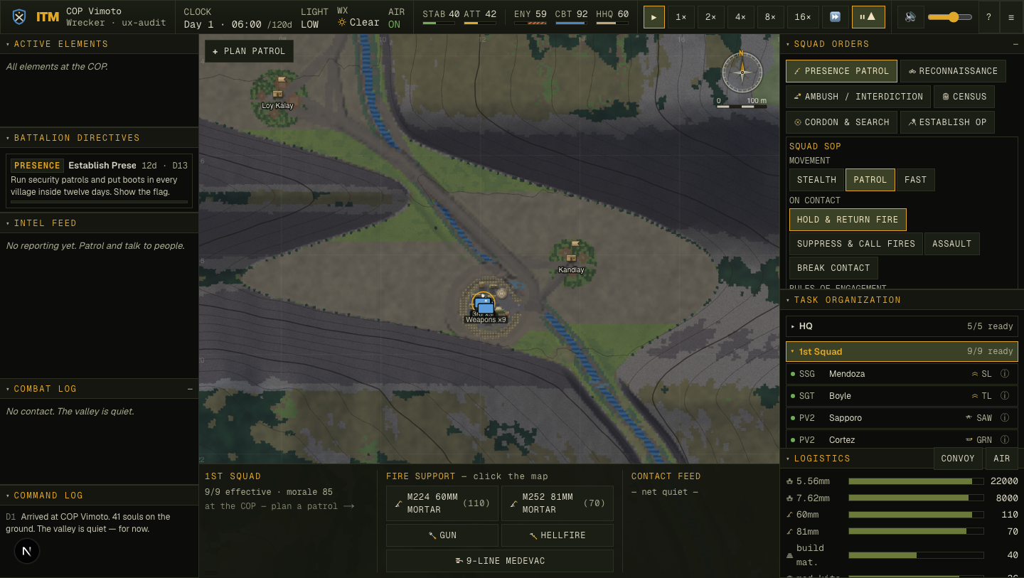
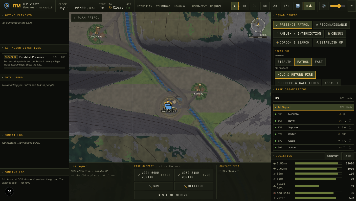
The HUD a commander stares at for a whole deployment was dense, handsome — and quietly hostile: built on 9–11px text, with zero keyboard-focus visibility, no motion-safety, icon buttons a screen reader announces as "button," and the campaign's north-star metrics rendered as five identical 2.5-pixel slivers. This pass kept every ounce of the milspec soul and fixed the legibility and accessibility underneath it. The headline is a measured number, not a vibe: 461 → 1 objective UX defects, independently corroborated by an expert panel that unanimously preferred the result.
Why "20×" had to become a number first
The brief was "improve all of UI/UX and don't stop until you can validate a 20× improvement." On this project a fuzzy goal is forbidden until it's a metric — no fix without a number. So before touching a single pixel, the first deliverable was an oracle: a headless harness (scripts/ux-audit.mjs) that drives the real running game over Chrome DevTools, walks the live rendered DOM across four states (menu · HUD · village panel · soldier dossier), and counts WCAG/usability defects the way a low-vision or keyboard user actually experiences them:
:focus-visible indicator anywhere in the stylesheets.prefers-reduced-motion block exists.The metric is deterministic and seed-independent — it reproduces the same number on every run, which makes every "fixed" provable as a delta. Baselining HEAD before any edit gave the unflattering truth:
tinyText 262 (121 of them sub-11px) · noFocusRing 152 · tinyTarget 33 · unlabeled 10 · contrast 2 · reducedMotion 2. The data already killed a lazy hypothesis: a dark milspec theme is not a contrast disaster (only 2 nodes fail AA). The debt was legibility and a total absence of keyboard accessibility.
The 461 → 1 collapse
Two structural moves did almost all of it. One global :focus-visible rule retired 152 focus failures at a stroke. And rather than hand-edit ~100 className strings, one centralized override in globals.css remapped the dense 8–11px type ramp above a 12px floor — Tailwind v4 puts arbitrary utilities in a layer, so an unlayered rule wins the cascade — taking 262 sub-12px nodes to zero while preserving density and the milspec hierarchy (which is carried by colour, weight and stencil-caps, not a 1px step).
Total, across four rounds
461 → 1
HEAD 461 → 261 after the a11y foundations → 1 after the legibility floor. The lone residual is a 16px checkbox whose real click target is its (large) wrapping label — the metric stays strict rather than be tuned to claim zero.
Verified, not just counted
A font-size bump can trade a defect score for a broken layout the counter can't see. So a second oracle checks scrollWidth > clientWidth on every clipping box: 0 clipped (excluding by-design .truncate) across all four states. And a keyboard-behaviour harness drove the real app — 6/6 pass: dialogs trap focus, move focus in, and close on Escape.
The work, round by round
Sequenced lowest-risk-first, each round re-measured in isolation, each an atomic commit on a main shared live with a parallel realism pass (one writer per file; never git add -A).
Round 1 — accessibility & legibility foundations
- One global
:focus-visibleamber ring — keyboard commanders can finally see where they are. 152 → 0 @media (prefers-reduced-motion)stills the blink / spinner / fade / scanline shimmer — the flashing rust TIC cue is a genuine photosensitivity hazard at the worst moment. motion-safe- Tokenized type floor: 8/9/10px → 12px, 11px → 13px, in one place. 262 → 0
- aria-labels on the dock resize separators; 24px hit-floor on buttons. unlabeled 10→0, targets 33→1
- Two palette nudges so warning text and secondary type clear AA. contrast 2→0
Round 2 — hierarchy, feedback & the strategic anchor

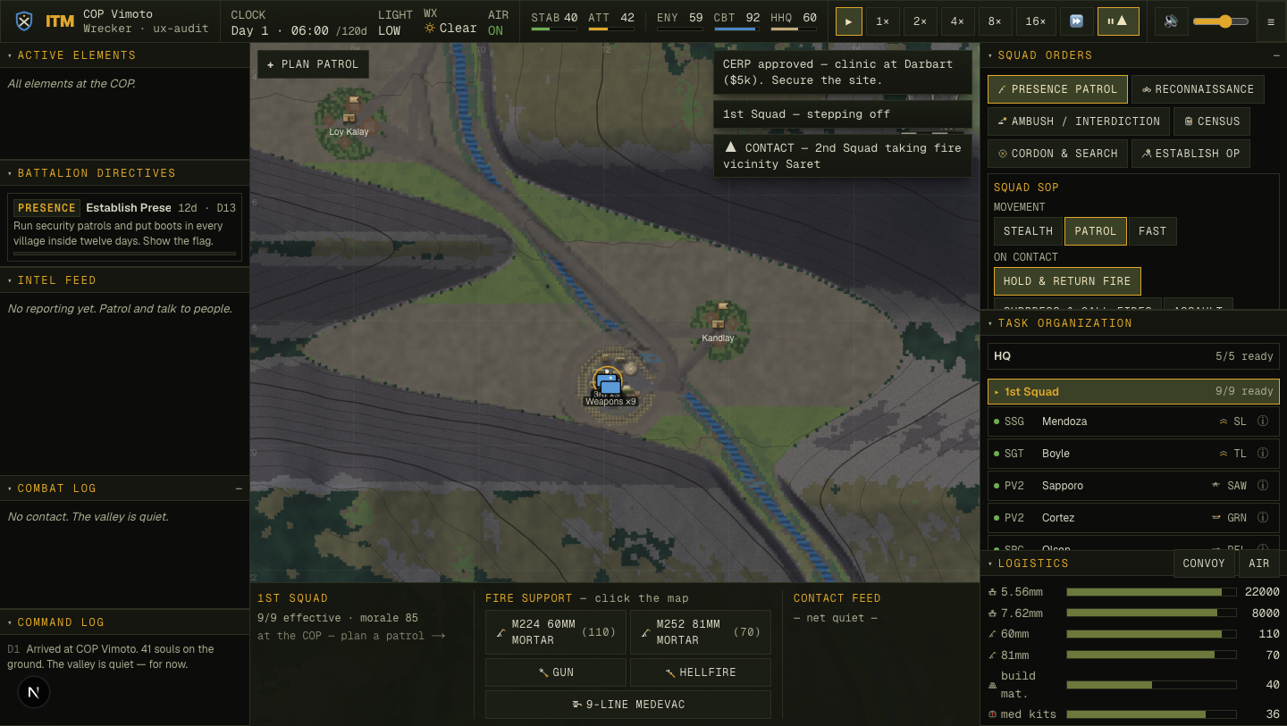
data-contact posture flag leans the whole HUD into the fight.Round 3 — discoverability & the modal-a11y a skeptic finds
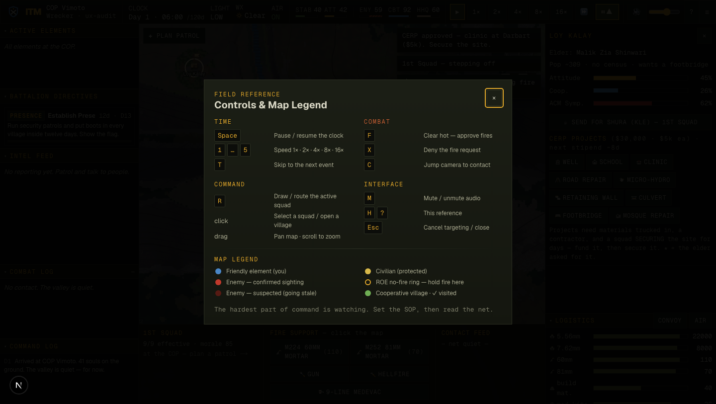
F = clear-hot lever was discoverable only by reading source. A new ? / H overlay lists every binding in stencil groups with kbd chips, plus a map legend whose swatches use the exact CSS tokens the renderer uses, so legend and map can never drift. Built on a shared accessible Modal (role=dialog, aria-modal, focus-trap, Escape, focus-restore) that also fixed the Situation-event dialog — which previously had no Escape and trapped a keyboard user with no way out.Round 4 — feedback-driven: the left column
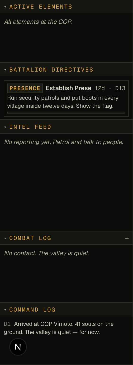
--ink-2 tone brightens running narrative (directive descriptions, command-log lines) while metadata stays dim — so hierarchy survives and the net "read the fight at a glance" actually reads.The owner's own notes, addressed
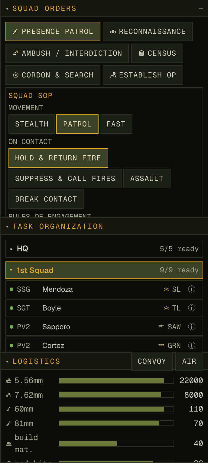
Mid-pass the owner flagged three concrete annoyances in the right command column. All three shipped:
Did it actually get better? An adversarial second opinion
The defect count is one axis; it can't see whether the thing reads well. So a five-persona expert panel — a Nielsen-Norman usability lead, a WCAG auditor, a AAA strategy-game UI director, a type/visual-systems designer, and a former infantry officer — scored the before and after paired, on the same rubric, and were explicitly asked to stay adversarial. All five preferred the redesign; mean perceived improvement 2.3×.
The full before/after, in one frame (the same default-zoom HUD, same seed):
What still isn't done — logged, not rounded up
The same adversarial panel named real residuals. They are recorded here rather than buried, because a partial win stated as total is the one unforgivable move:
- Colour still carries some status alone. The roster readiness dots and the village attitude bars encode state by hue (the dots have hover tooltips, the meters have numbers + the ENEMY hatch, but the dots/bars lack an always-visible shape cue). A future pass should add a glyph/letter fallback for full WCAG 1.4.1.
- The full HUD is still dense at game scale. The ≥12px floor is real, but the bottom fire-support / contact-feed strip remains tight; the hi-detail crops read best.
- Focus visibility is proven behaviourally, not in a still. The ring only shows during live keyboard nav; the 6/6 behavioural pass and the stylesheet rule are the evidence, not a screenshot.
- The right column can still scroll when a 9-man roster is expanded — mitigated by collapse + resize, not eliminated.
How it was built — the orchestration
This was not one model typing. The shape, in the project's own doctrine: metricize → survey → judge → synthesize → implement → adversarially verify.